Table of Contents
Introduction
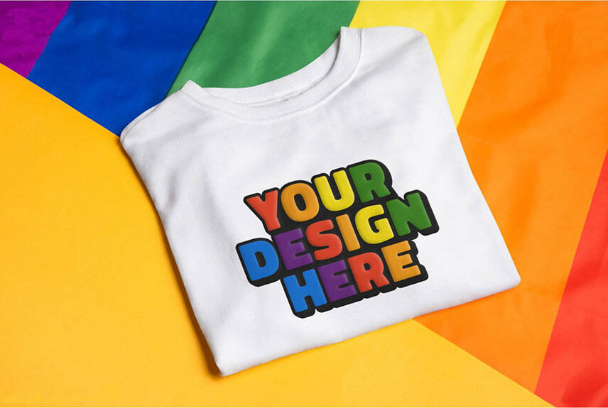
Creating eye-catching pieces with puff vinyl color choices can be hard, but we make it easy for you. We welcome you to the best guide on the internet regarding puff vinyl color combinations.
In this article, we will discuss in detail the colors and their role in producing fascinating designs with puffy vinyl.
The complete guide will give you the top secrets and practical ideas to make industry-leading designs. This guide will help you, whether you are a struggling designer or an expert looking to upgrade your skills.
Let’s dive deeper into the details.
Importance of Color Combinations in Designing
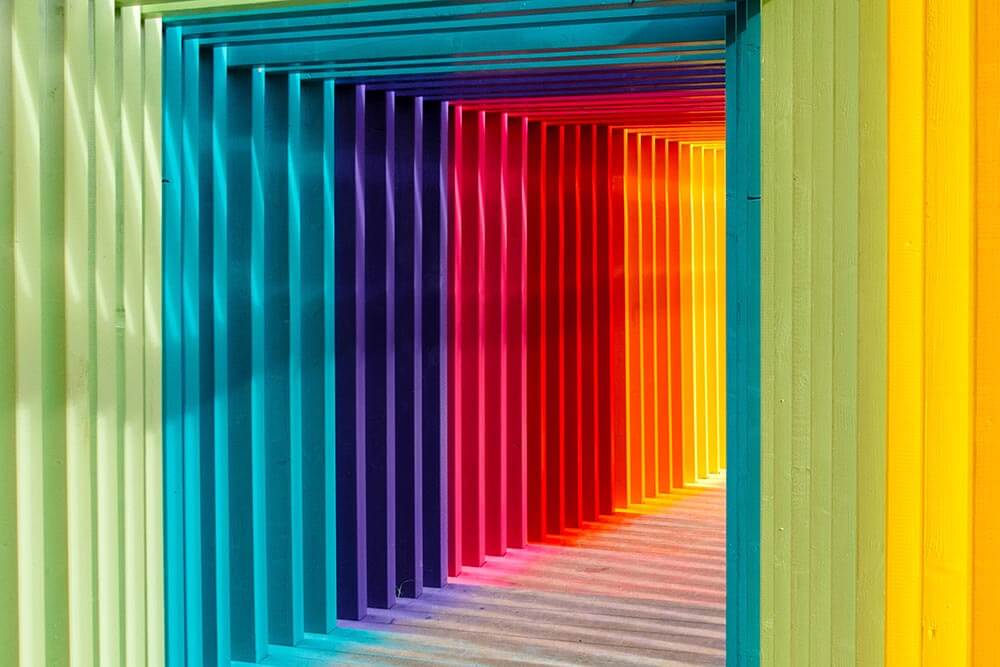
We all know the importance of colors in life. Colors make things beautiful. Often we buy things based on their colors.
Colors are important in designing. Colors stimulate emotions and set moods, and most importantly, colors can help you convey your brand message.
Using the perfect color combination for your product improves the visual impact of your design. It makes them more appealing.
Once you realize the importance of colors in designing. Let us help you to make the perfect color palette for your puff vinyl.
Creativity is inventing, experimenting, growing, taking risks, breaking rules, making mistakes, and having fun.”
– Mary Lou Cook
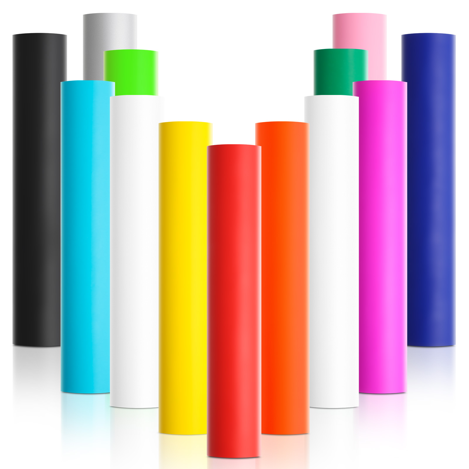
1. Choose the Right Color Palette
The right color choice is extremely important for creating spectacular puff vinyl designs.
To use the perfect color, understand the color theory basics. Learn about the color wheel, primary, secondary, and tertiary colors, and warm and cool tones.
It can also help you to understand hue and tints, shades, and color harmony principles. When confused, you can use this website as a guide: https://coolors.co.
2. Analyzing The Target Audience
Analyzing the target audience is extremely significant when deciding your colors for puff vinyl. Consider the preferences and qualities of your target audience.
Specific color combinations often impact certain age groups, ethnic, and demographics. Customizing your design according to your targeted audience will boost their attractiveness and interest. It can 10X your sales.
3. Mood and Emotions
Colors have the power to create emotions and boost moods. Choose your colors wisely.
Choose colors based on the emotional impact you want to make on your audience.
If you want to produce feelings of liveliness and enthusiasm use warm tones. If you want to generate feelings of peace and tranquility, use warm colors.
This is the trick top brands use to meet their customer’s needs.
4. Branding and Purpose
When you are designing puff vinyl make sure that they match your brand’s identity and values. Colors can elicit distinct emotions. Colors deliver the brand personality. Ensure that the color palette of your puff vinyl aligns with the spirit of your brand.
5. Contrast and readability
The color you chose should give enough contrast for reading. The design may be difficult to read if the color mixes or lacks contrast. Use editing software to test your color choice on diverse backgrounds. While editing, keep accessibility rules in mind to generate a user-friendly design with the best color contrast.
Puffy Vinyl Color Combinations: Tips and Ideas

Now that you know the importance of color theory and color palette selection. Let’s look at some amazing tips and ideas for making bright puff vinyl designs.
These ideas will help you generate the best puff vinyl design. This will create a lasting impression on your users.
1. Creating Contrast and Balance
Contrast and proportion are two important criteria for the stunning puff vinyl design. Contrast improves the visual interest. It helps the significant piece stand out. The balance guarantees that the arrangement is harmonious.
Use clashing colors to generate vigorous and visually appealing designs.
2. Popular Color Combinations for Puff Vinyl Designs
Certain color combinations in puff vinyl designs have been popular for years. These combinations are visually appealing and attention-grabbing. Let’s have a look at some of these amazing color combinations:
Black and Gold together create an elegant appearance. This color combination gives puff vinyl a luxurious touch.
- Pastel Hues
Pastel colors for example pink, yellow, and blue give your puff vinyl a delicate look.
You can use this color palette if your targeted audience is younger girls or those looking for a delicate feminine touch.
Neon colors are known for their high visibility. You can use vibrant neon colors to last a visually striking impact.
- Earthy Tones
If you want to give your puff vinyl a natural tone use earthy tones. Earthy tones include warm brown, rich greens, and rusty oranges. Earthy tones inspire a sense of nature. These are ideal color designs with a natural or rustic theme.
3. Split-Complementary Color Schemes: Harmonious Contrasts
Split-complementary color schemes involve three colors. It begins with a base color and then and then moves on to the two colors adjacent to its complementary color.
This results in an amazing colorful contrast that makes your puff vinyl irresistible.
To create a balanced yet contrasting palette, experiment with split-complementary color schemes.
4. Tetradic Color Harmonies: A Palette with Variety
Choosing four colors from two sets of complementary colors produces tetradic color harmonies. This makes an assorted and versatile palette.
Tetradic color is the best way to produce versatile and visually appealing designs.
5. Using Analogous Color Schemes
Colors next to each other on the color wheel are used in analogous color schemes. This creates a harmonious design.
Use different color combinations to get your best analogous color scheme to schedule ideal balance and contrast.
6. Incorporating Complementary Colors
If you want to create vibrate and enthusiastic puff vinyl designs incorporate complementary colors. On the color wheel, complementary colors are opposite to each other.
Incorporating complementary colors in your design creates an eye-catching contrast.
7. Triadic Color Schemes for Vibrant Designs
A triadic color scheme is the best scheme to generate designs that stand out visually from others. Triadic colors are spaced evenly on the color wheel.
Choosing triadic color schemes results in a colorful and dynamic appearance.
8. Monochromatic Color Palettes:Simplicity and Elegance
Simple, yet the most appealing design for an elegant audience. Monochromatic color palettes employ several hues, tints, and tones of a single color.
This gives your design a sophisticated yet elegant appearance.
Conclusion
Designing vivid pieces with puff vinyl color combinations is a creative and satisfying process. You can create designs that leave a long-lasting impact by using color schemes and experimenting with different colors. Meanwhile, keep your target audience in mind while crafting the colors for your puff vinyl.
Using these tips and techniques experiment with colors, embrace your creativity, and watch your puff vinyl masterpiece come to life.
Frequently Asked Questions
What are some popular color combinations?
The popular color combination that provides a variety of aesthetics and cater to a diverse audience are:
● Black and gold
● Pastel hues
● Brilliant neons
● Earthy tones
How can I make my puff vinyl designs stand out?
You can use the following methods to make your puff vinyl design stand out
● Use bright eye-catching colors
● Explore different color schemes
● Adjust your designs according to your target audience
● Stay up to date on the newest designs and trends in the market
● Use contrast and balance
● Include text and patterns in your design
● Take note of typography and layout
How do I use analogous color schemes effectively?
Use can use analogous color schemes effectively in your design by following the tips
● Know the target emotion you want to generate in your audience then use that color scheme
● Chose a similar color to the dominant group
● Use other colors to draw attention to specific elements
● Balance the color distribution
How do I incorporate split-complementary colors?
The following steps can be used to include split complementary colors in your puff vinyl design
● Select your base color
● Then select two colors that are adjacent on the color wheel of the base color
● Use the base color as a dominant hue and the neighboring colors as accents
● To achieve a harmonic contrast, maintain a balanced color distribution in your design
What are Tetradic color harmonies?
Tetradic color hormones are created by selecting four colors that are made up of two sets of complementary colors. This diversifies your palette.
It enables you to develop visually intriguing puff vinyl designs.
How do I choose the right color combination?
Choosing the right color is the prime factor in developing puff vinyl designs. Consider the following suggestions to choose the best color:
1. Learn the fundamentals of color theory
2. Learn Color harmony
3. Keep in mind the preferences and qualities of your target audience
4. Align your color choices with the brand’s design and purpose
5. Ensure satisfactory contrast and readability
6. Explore different color combinations
7. Use colors according to the emotions you want to generate
What are complementary colors?
Complementary colors create great visual impact and vitality to puff vinyl design. Complementary colors are pairs of colors that are opposite to each other on the color wheel.
They provide a high contrast. Complementary colors help each other stand out when used together.
How do I use triadic color schemes in my design?
To use a triadic color palette in your puff vinyl design, consider the following suggestions
● Select three colors that are adjacent to each other on the color wheel
● Make one color as base and the other two accents
● Balance the colors evenly in the design
● Explore different triadic schemes to generate visually appealing designs.
What are monochromatic color palettes?
A monochromatic color palette generates simple yet elegant designs. In a monochromatic color palette, different shades, tints,, and tones of a single color are used in a design.
How can I create contrast in my designs?
To create contrast in your design, follow the following suggestions
● Use complementary colors
● Use light and dark shades
● Combine bold and muted tones
Keep experimenting with different contrasts until you reach your desired contrast.
What is the significance of color balance?
Color balance ensures that color distribution in a design is appealing and harmonious. Color balancing enhances the appearance of puff vinyl design.